主要なCSSフレームワークでデフォルト設定されているブレイクポイントまとめ
今回は、主要なCSSフレームワークでデフォルト設定されているブレイクポイントについて調べたのでまとめてみました。
今回紹介するCSSフレームワークは、下記の通りです。
また、最後には各フレームワークごとにデフォルト設定されているブレイクポイントをまとめてありますので、CSSフレームワークの比較などを行いたい方はそちらをご覧ください。
Tailwind CSS
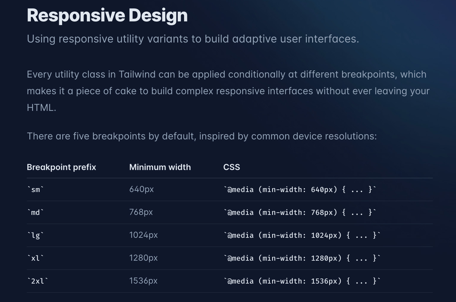
Tailwind CSSのブレイクポイント
Tailwind CSSでデフォルト設定されているブレイクポイントは、以下のようになっています。
| sm | md | lg | xl | 2xl |
|---|---|---|---|---|
| 640px | 768px | 1024px | 1280px | 1536px |
・参考ページ:
https://tailwindcss.com/docs/responsive-design
Bulma
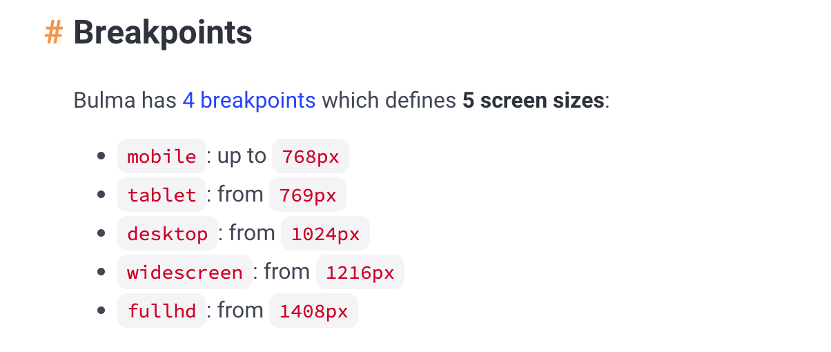
Bulmaのブレイクポイント
Bulmaでデフォルト設定されているブレイクポイントは、以下のようになっています。
| Mobile | Tablet | Desktop | Widescreen | FullHD |
|---|---|---|---|---|
| Up to 768px | Between 769px and 1023px | Between 1024px and 1215px | Between 1216px and 1407px | 1408px and above |
・参考ページ:
https://bulma.io/documentation/overview/responsiveness/#breakpoints
Pure CSS
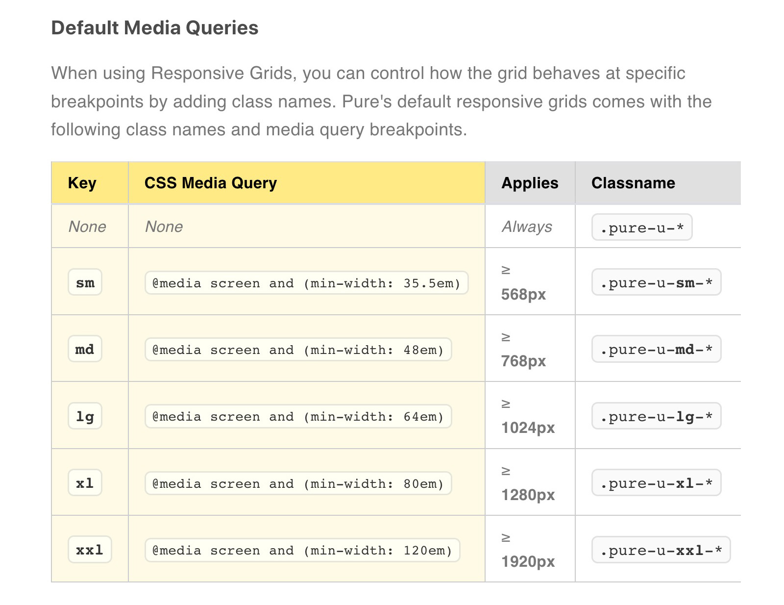
Pure CSSのブレイクポイント
Pure CSSでデフォルト設定されているブレイクポイントは、以下のようになっています。
| sm | md | lg | xl | xxl |
|---|---|---|---|---|
| ≥ 568px | ≥ 768px | ≥ 1024px | ≥ 1280px | ≥ 1920px |
・参考ページ: https://purecss.io/grids/
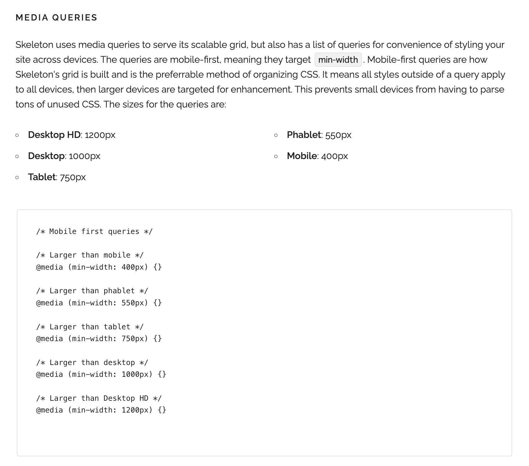
Skeleton
Skeletonのブレイクポイント
Skeletonでデフォルト設定されているブレイクポイントは、以下のようになっています。
| Mobile | Phablet | Tablet | Desktop | Desktop HD |
|---|---|---|---|---|
| 400px | 550px | 750px | 1000px | 1200px |
・参考ページ: http://getskeleton.com/
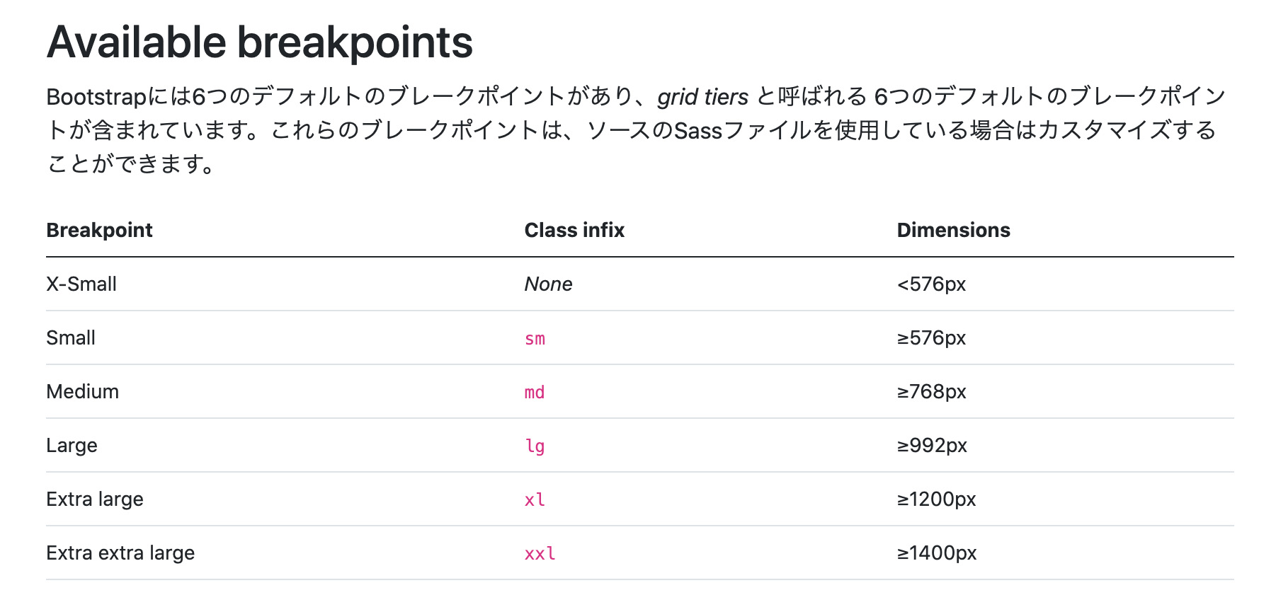
Bootstrap
Bootstrapのブレイクポイント
Bootstrapでデフォルト設定されているブレイクポイントは、以下のようになっています。
| Small | Medium | Large | Extra large | Extra extra large |
|---|---|---|---|---|
| ≥ 576px | ≥ 768px | ≥ 992px | ≥ 1200px | ≥ 1400px |
・参考ページ:
https://getbootstrap.jp/docs/5.0/layout/breakpoints/#available-breakpoints
Semantic UI
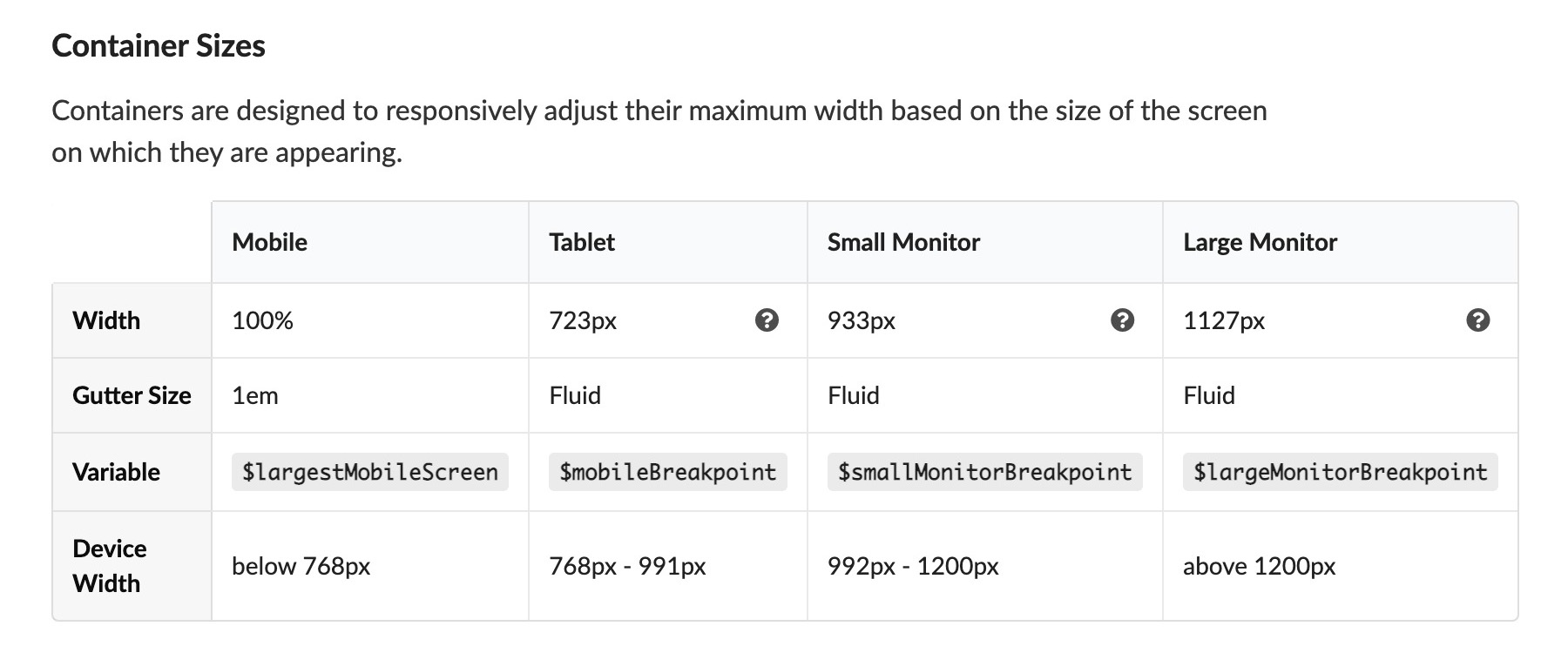
Semantic UIのブレイクポイント
Semantic UIでデフォルト設定されているブレイクポイントは、以下のようになっています。
| Mobile | Tablet | Small Monitor | Large Monitor |
|---|---|---|---|
| below 768px | 768px – 991px | 992px – 1200px | above 1200px |
・参考ページ:
https://semantic-ui.com/elements/container.html
Materialize
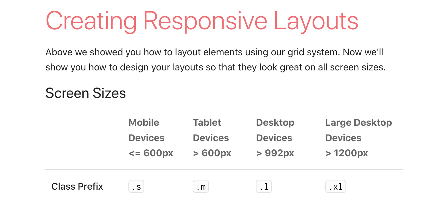
Materializeのブレイクポイント
Materializeでデフォルト設定されているブレイクポイントは、以下のようになっています。
| Mobile Devices | Tablet Devices | Desktop Devices | Large Desktop Devices |
|---|---|---|---|
| <= 600px | > 600px | > 992px | > 1200px |
・参考ページ:
https://materializecss.com/grid.html#grid-responsive
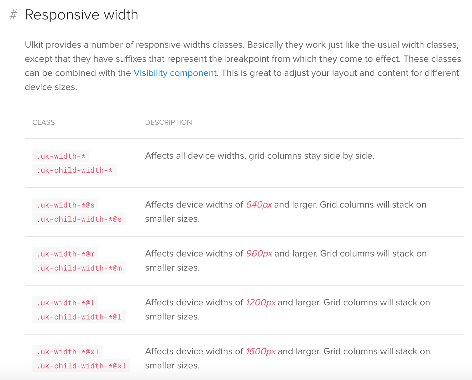
UIkit
UIkitのブレイクポイント
UIkitでデフォルト設定されているブレイクポイントは、以下のようになっています。
| s | m | l | xl |
|---|---|---|---|
| 640px | 960px | 1200px | 1600px |
・参考ページ:
https://getuikit.com/docs/width#responsive-width
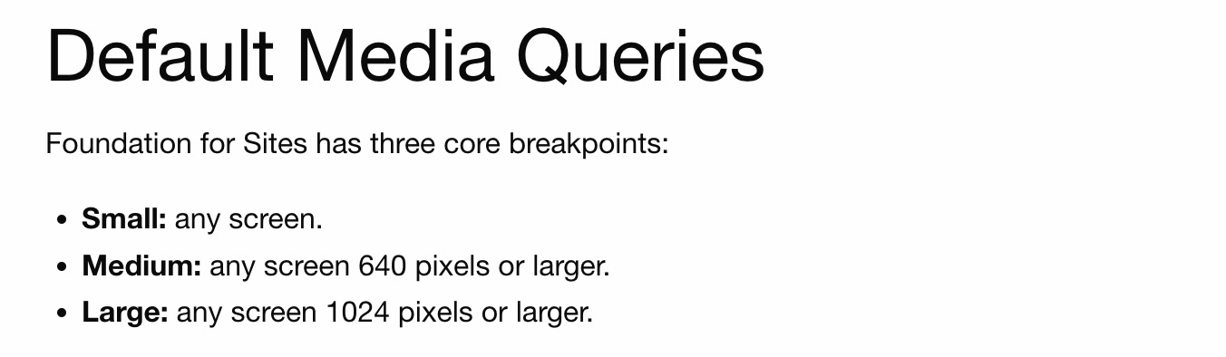
Foundation
Foundationのブレイクポイント
Foundationでデフォルト設定されているブレイクポイントは、以下のようになっています。
| Small | Medium | Large |
|---|---|---|
| any screen | 640 pixels or larger | 1024 pixels or larger |
・参考ページ:
https://get.foundation/sites/docs/media-queries.html#default-media-queries
まとめ
ここでは、各CSSフレームワークでデフォルト設定されているブレイクポイントだけをまとめて紹介していきます。
| CSSフレームワーク | ブレイクポイント |
|---|---|
| Tailwind CSS | 640px, 768px, 1024px, 1280px, 1536px |
| Bulma | 768px, 1024px, 1216px, 1408px |
| Pure CSS | 568px, 768px, 1024px, 1280px, 1920px |
| Skeleton | 400px, 550px, 750px, 1000px, 1200px |
| Bootstrap | 576px, 768px, 992px, 1200px, 1400px |
| Semantic UI | 768px, 992px, 1200px |
| Materialize | 600px, 992px, 1200px |
| UIkit | 640px, 960px, 1200px, 1600px |
| Foundation | 640px, 1024px |
以上、主要なCSSフレームワークでデフォルト設定されているブレイクポイントについて紹介してきました。
関連記事
Tailwind CSSとは?高速かつ柔軟なUtility-First CSSフレームワークを徹底解説
Tailwind CSSの基本から応用までを徹底解説!Utility-Firstなアプローチ、他のCSSフレームワークとの違い、高速開発を実現するメリット・デメリット、そして導入方法を初心者向けに分かりやすく紹介。モダンなWeb開発で注目のTailwind CSSの全貌を理解し、あなたのCSS開発を次のレベルへ。
日本国内のデバイス別ディスプレイサイズ(解像度)シェア
日本国内のデバイス別のディスプレイサイズ(解像度)のシェア状況を調べてみましたので、デバイス別(デスクトップ、タブレット、スマートフォン)にそれぞれサイズとシェアをまとめておきます。

コメントを残す